


A Graphic Demise of the U.S. dollar
Back in the 1970s when I was in college, the United States was experiencing price inflation and as an economics major, we studied money and inflation. In fact, my dad even wrote a book about inflation. As you can see from the following graph, the price inflation rate was in excess of 10% at times.
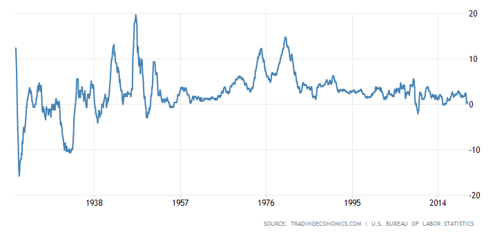
Source: TradingEconomics.com | U.S. Bureau of Labor Statistics
Since then, 3 things have happened:
- Paul Volcker raised interest rates to about 20% and cut money printing in the early 1980s, thus encouraging people to hold their dollars and reduce the inflation rate.
- The U.S. government changed the way it calculated the inflation rate. It removed certain items from its calculation, like food and fuel, and it introduced the notion of equivalents. This has limited the answer we get when we ask what the price inflation rate is. If we use the same method to calculate price inflation that was used back in the 1970s, the results are shown by shadowstats.com in the following graph:
- There has been an increased demand for U.S. dollars since then, as the world uses the U.S. dollar as the world’s reserve currency and much of the world uses dollars for commodity purchases. Even today, the U.S. dollar is perceived as a safe haven for investors who are fleeing other less-stable fiat currencies. And lately, the coronavirus has actually accentuated this drive to “safety” in an uncertain and panicky world.
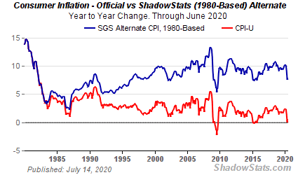
Source: ShadowStats.com
Based on this information, we can see that price inflation has recently ranged from 5 to 12%.
As the following graph shows, the Fed has increased the quantity of U.S. dollars. The question is: will we see more price inflation, as a result of the increased volume of dollars, or will the world-wide demand for U.S. dollars dampen the tendency to raise prices? Notice the blip in dollar supply back in the 1970s when we had 10 to 15% inflation…do you see it? I don’t. But I see the more recent spike.
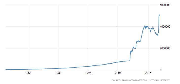
Source: TradingEconomics.com | U.S. Bureau of Labor Statistics
By the way, the European Central Bank is also increasing its supply of Euros. See below:
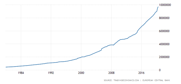
Source: TradingEconomics.com | European Central Bank
We might look to the price of gold as an indicator of things to come as it is an international barometer of prices and safety. The following graph shows the price of gold in U.S. dollars. As we can see, the price has recently hit an all-time high in nominal dollars.
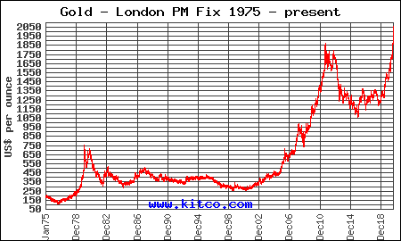
Source: Kitco.com
However, if we adjust for inflation, as the following graph shows, the price is nowhere near its previous peak from the late 1970s.
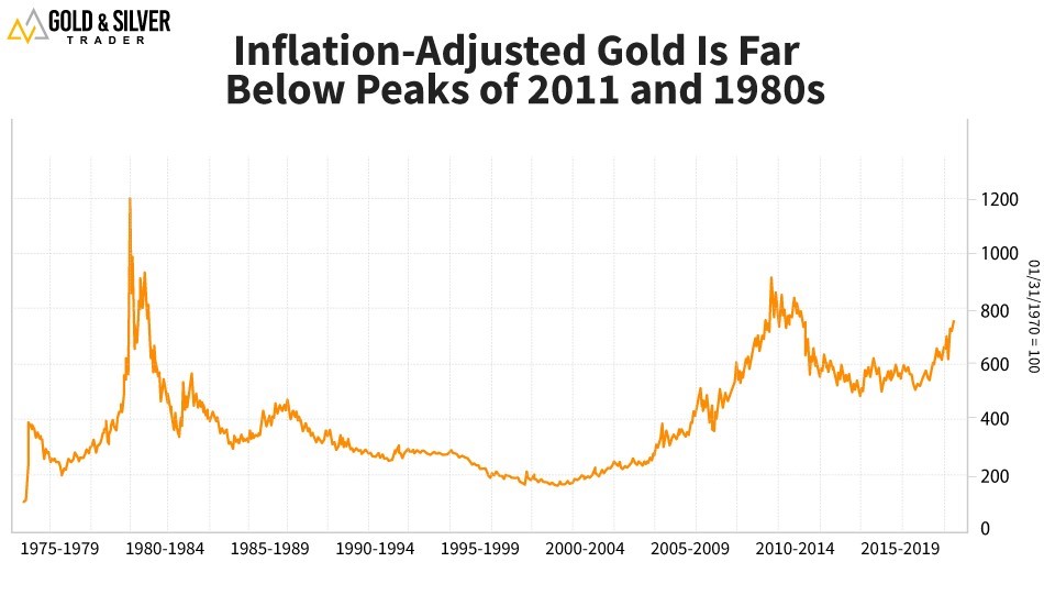
Source: WeissRatings.com
My bet is that we are about to see a huge spike in prices of all tangible assets, and claims to tangible assets. Let’s see if I’m right.
Robert F. Sennholz
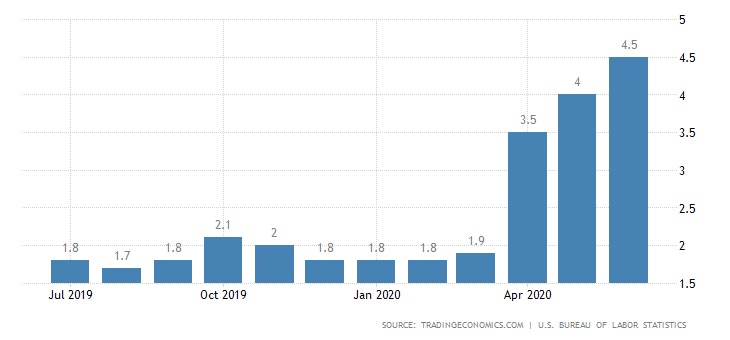
P.S. Check out this chart of U.S. food price inflation for 2019 and 2020: